Exploring the Growth Rate of the stringy05 Index

scagnostics
minimum spanning tree
stringy05
asymptotic analysis
R
A theoretical and empirical exploration of the stringy05 scagnostic index.
Published

30 Aug 2026

Aim

The goal of this blog is to understand the asymptotic behavior of the stringy05 index, defined as

\[ \text{stringy05} = \frac{{diameter}(T_n)}{{length}(T_n)}. \]

Here \(T_n\) is the Euclidean minimum spanning tree (MST) built on \(n\) random bivariate observations.

The denominator is the total Euclidean length of the MST,

\[ L_n = {length}(T_n) = \sum_{e\in T_n}|e|. \]

The numerator is the weighted graph diameter of the MST,

\[ D_n = {diameter}(T_n) = \max_{u,v\in T_n} d_{T_n}(u,v), \] where \(d_{T_n}(u,v)\) is the length of the unique path in the tree from \(u\) to \(v\), using Euclidean edge lengths as weights.

Thus,

\[ R_n = \text{stringy05}(T_n) = \frac{D_n}{L_n}. \]

The main question is whether

\[ R_n \to 0, \]

or whether

\[ R_n \to \rho > 0. \]

Empirically, previous simulations suggested that the ratio does not rapidly decay toward zero. Around sample sizes near \(n=900\), the estimated 95th percentile of the noise distribution appeared to stabilize near \(0.1\). This motivates a more detailed investigation of the numerator and denominator separately.

Denominator: theoretical growth rate of total MST length

The denominator \(L_n\) is the part of the problem for which we do have strong theoretical guidance.

Steele (1988) studies Euclidean minimal spanning trees with power-weighted edges. In his notation, for points \(x_1,\dots,x_n\), the MST functional is

\[ M(x_1,\dots,x_n) = \min_T \sum_{e\in T}\psi(|e|), \]

where the minimum is over spanning trees \(T\), and \(\psi\) is an edge-weighting function (Steele 1988).

For the ordinary Euclidean MST length, we take

\[ \psi(t)=t. \]

Then

\[ M(X_1,\dots,X_n) = \sum_{e\in T_n}|e| = L_n. \]

So Steele’s \(M_n\) (Steele 1988) is exactly the denominator of the stringy05 index.

Steele’s growth theorem

Steele (1988) considers weight functions satisfying

\[ \psi(t)\sim t^\alpha \quad\text{as } t\to 0, \]

with

\[ 0<\alpha<d. \]

His main theorem states that, for iid observations in \(\mathbb R^d\) from a compactly supported distribution, if \(f\) is the density of the absolutely continuous part of the distribution, then

\[ n^{-(d-\alpha)/d} M(X_1,\dots,X_n) \to c(\alpha,d) \int f(x)^{(d-\alpha)/d}\,dx \]

almost surely.

In the ordinary MST length case,

\[ \alpha=1. \]

For bivariate data,

\[ d=2. \]

Therefore,

\[ n^{-1/2}L_n \to c(1,2) \int f(x)^{1/2}\,dx. \]

Equivalently,

\[ L_n \sim C_f\sqrt n, \]

where

\[ C_f = c(1,2) \int f(x)^{1/2}\,dx. \]

Thus, for two-dimensional data, the denominator has theoretical growth rate

\[ \boxed{ L_n= O(\sqrt n). } \]

Steele (1988) first proves the MST growth-rate result in the uniform setting, where the sample points are distributed in the unit cube. The result is then extended beyond the uniform case by adding a density correction. For a more general distribution with density \(f\), the limiting constant is modified by a factor of the form

\[ \int f(x)^{(d-\alpha)/d}\,dx. \]

In the ordinary bivariate MST-length case, this becomes

\[ \int f(x)^{1/2}\,dx. \]

This extension is important for my project because the simulations are based on bivariate noise distributions rather than only uniform samples.

However, there is one important technical caveat. The theorem in Steele (1988) is stated under compact-support assumptions. A standard bivariate normal distribution has unbounded support, so it falls outside the direct assumptions of the theorem. Therefore, for Gaussian samples, I use the \(\sqrt n\) scaling from Steele (1988) as a theoretically motivated benchmark for the denominator, not as a theorem that applies directly without further work.

Numerator: what is known about the MST diameter?

The numerator is

\[ D_n = \max_{u,v}d_{T_n}(u,v). \]

This is the weighted longest shortest path in the MST. It is a global path functional: it depends on how many edges lie along the longest path and how their lengths accumulate.

This is different from the total MST length \(L_n\), which is a sum over all edges. It is also different from the longest single edge of the MST.

At this point, the exact theoretical growth rate of \(D_n\) is not given by the MST length theorem in Steele (1988).

Penrose’s longest-edge theorem and its limitation

Penrose (1997) studies the longest edge of the random Euclidean MST. Let

\[ E_n = \max_{e\in T_n}|e|. \]

For uniform random points in the unit square, Penrose (1997) shows that the longest MST edge has the same asymptotic extreme-value behavior as the longest nearest-neighbor edge. In dimension \(2\), the result implies that

\[ n\pi E_n^2-\log n \]

converges in distribution to a double-exponential limiting law (Penrose 1997).

Penrose (1997) also shows that very long MST edges usually behave like nearest-neighbor edges. In other words, the longest edges are typically attached to leaf vertices, or endpoints, of the MST.

This matters for the stringy05 index because the MST diameter is not just the longest single edge. The diameter is the length of a whole path through the tree. So the result in Penrose (1997) suggests that the longest individual edges are often at the outside of the tree, rather than forming the main interior path that determines the MST diameter.

The longest edge scale is therefore approximately

\[ E_n \asymp \sqrt{\frac{\log n}{n}}. \] However, this is not the same as the stringy05 numerator.

The stringy05 numerator is

\[ D_n = \max_{u,v} d_{T_n}(u,v), \]

which is the length of an entire path. This path may contain many MST edges. Therefore, the theorem in Penrose (1997) does not give the growth rate of \(D_n\). It only gives the scale of the largest individual edge.

A simple example: longest edge versus MST diameter

Let’s imagine the MST is a path with five vertices:

\[ A \;-\; B \;-\; C \;-\; D \;-\; E \]

and the edge weights are

\[ |AB|=0.10,\quad |BC|=0.12,\quad |CD|=0.09,\quad |DE|=0.11. \]

Penrose’s longest-edge quantity looks only for the single largest edge in the MST:

\[ E_n=\max_{e\in T_n}|e|=0.12. \]

So in this example, Penrose’s quantity is the edge \(BC\).

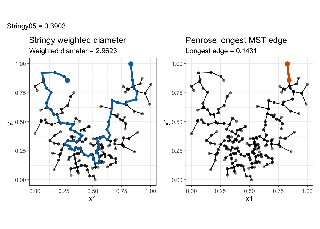
But the stringy05 numerator is the weighted MST diameter. It looks for the longest path in the tree and adds all edge weights along that path. Here the longest path is from \(A\)) to \(E\):

\[ D_n = |AB|+|BC|+|CD|+|DE| = 0.10+0.12+0.09+0.11 = 0.42. \]

So in this example,

\[ \text{Penrose longest edge}=0.12, \]

while

\[ \text{stringy05 diameter}=0.42. \]

Code
library(cassowaryr)
library(igraph)
library(ggplot2)
library(patchwork)
library(knitr)

set.seed(1050)

n <- 200
u <- runif(n, -1, 1)
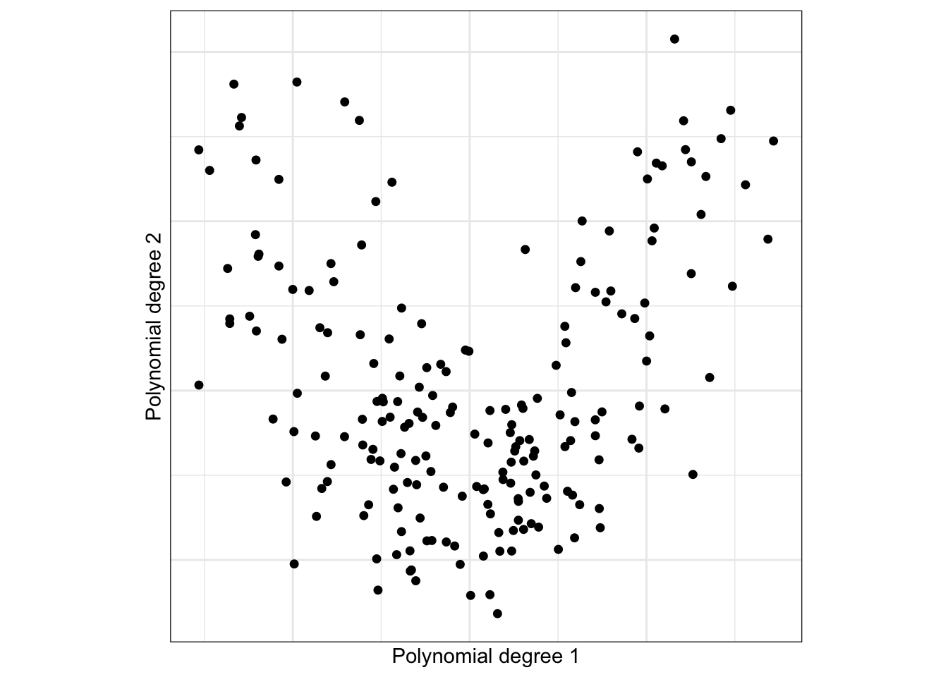
polynomial <- poly(u, degree = 2)

x <- polynomial[, 1] + rnorm(n, sd = 0.03)
y <- polynomial[, 2] + rnorm(n, sd = 0.03)

ggplot(data.frame(x, y), aes(x, y)) +
  geom_point(size = 1.6) +
  coord_equal() +
  theme_bw() +
  labs(
    x = "Polynomial degree 1",
    y = "Polynomial degree 2"
  ) +
  theme(aspect.ratio = 1,
        axis.ticks = element_blank(),
        axis.text = element_blank())

Construct the minimum spanning tree

Code
sc <- scree(
  x,
  y,
  out.rm = FALSE,
  binner = NULL
)

mst <- cassowaryr:::gen_mst(
  sc$del,
  sc$weights
)

mst_weights <- E(mst)$weight

Calculate the two diameter definitions

Code
# Stringy: longest weighted path through the MST
diameter_path <- get_diameter(
  mst,
  directed = FALSE,
  weights = mst_weights
)

weighted_diameter <- diameter(
  mst,
  directed = FALSE,
  weights = mst_weights
)

# Penrose: longest individual MST edge
longest_edge <- E(mst)[which.max(mst_weights)]
penrose_diameter <- longest_edge$weight

# Stringy05
stringy05 <- weighted_diameter / sum(mst_weights)

cat("Penrose longest edge:", round(penrose_diameter, 5), "\n")
Penrose longest edge: 0.14309 
Code
cat("Weighted MST diameter:", round(weighted_diameter, 5), "\n")
Weighted MST diameter: 2.96225 
Code
cat("Stringy05:", round(stringy05, 5), "\n")
Stringy05: 0.39027 

Draw the MST and highlight the two diameters

Code
# Coordinates of the Stringy diameter path
diameter_xy <- as.data.frame(
  sc$del$x[as.integer(diameter_path), ]
)

names(diameter_xy) <- c("x", "y")

# Coordinates of the longest individual edge
penrose_vertices <- ends(
  mst,
  longest_edge,
  names = FALSE
)

penrose_xy <- as.data.frame(
  sc$del$x[penrose_vertices, ]
)

names(penrose_xy) <- c("x", "y")

# Base MST plot supplied by cassowaryr
mst_plot <- draw_mst(mst, sc) +
  coord_equal() +
  theme_bw()

p_stringy <- mst_plot +
  geom_path(
    data = diameter_xy,
    aes(x, y),
    colour = "#0072B2",
    linewidth = 1.3
  ) +
  geom_point(
    data = diameter_xy[c(1, nrow(diameter_xy)), ],
    aes(x, y),
    colour = "#0072B2",
    size = 3
  ) +
  labs(
    title = "Stringy weighted diameter",
    subtitle = paste(
      "Weighted diameter =",
      round(weighted_diameter, 4)
    )
  )

p_penrose <- mst_plot +
  geom_segment(
    data = penrose_xy,
    aes(
      x = x[1],
      y = y[1],
      xend = x[2],
      yend = y[2]
    ),
    colour = "#D55E00",
    linewidth = 1.5
  ) +
  geom_point(
    data = penrose_xy,
    aes(x, y),
    colour = "#D55E00",
    size = 3
  ) +
  labs(
    title = "Penrose longest MST edge",
    subtitle = paste(
      "Longest edge =",
      round(penrose_diameter, 4)
    )
  )

p_stringy + p_penrose +
  plot_annotation(
    subtitle = paste(
      "Stringy05 =",
      round(stringy05, 4)
    )
  )

This shows why the result in Penrose (1997) is useful only as a weak lower bound. The longest single edge is always less than or equal to the weighted MST diameter, but it is not the same quantity:

\[ E_n\le D_n. \]

Upper and lower bound for the MST diameter

Even though the longest-edge theorem in Penrose (1997) does not solve the diameter problem, it provides a weak lower bound.

For every weighted tree,

\[ \boxed{ E_n\le D_n\le L_n. } \]

The first inequality holds because the longest edge is itself the path between its endpoints in the tree. The second inequality holds because any path in the tree uses only a subset of the edges of the tree.

Combining the longest-edge scale from Penrose (1997) with the total-length scale from Steele (1988) gives

\[ \sqrt{\frac{\log n}{n}} \lesssim D_n \le O(\sqrt n). \]

Dividing by \(L_n\) gives the weak theoretical ratio bound

\[ \frac{\sqrt{\log n}}{n} \lesssim R_n \le 1. \]

This lower bound is mathematically valid but very weak. For example, at \(n=1000\),

\[ \frac{\sqrt{\log(1000)}}{1000} \approx 0.00263. \]

This is much smaller than the empirical values observed in simulation, which are closer to \(0.2\). Therefore, the observed stringy05 behavior cannot be explained by the longest single MST edge alone. The diameter appears to be driven by the accumulation of many edges along a long path.

Next step: study numerator and denominator separately

The next part of this analysis will study

\[ L_n=\operatorname{length}(T_n) \]

and

\[ D_n=\operatorname{diameter}(T_n) \]

separately.

The plan is:

  1. Generate bivariate noise samples for a grid of sample sizes \(n\).
  2. Record the total MST length \(L_n\) .
  3. Record the weighted MST diameter \(D_n\).
  4. Record the ratio

\[ R_n=\frac{D_n}{L_n}. \]

For the denominator, the theorem in Steele (1988) suggests checking whether

\[ \frac{L_n}{\sqrt n} \]

stabilizes.

For the numerator, the key empirical question is whether

\[ \frac{D_n}{\sqrt n} \]

also stabilizes.

If both normalized quantities stabilize, then the ratio should stabilize near a positive constant:

\[ R_n = \frac{D_n}{L_n} \approx \frac{C_D\sqrt n}{C_L\sqrt n} = \frac{C_D}{C_L}. \]

This would support the empirical observation that stringy05 converges to a positive number, possibly near \(0.1\), rather than to zero.

Empirical check of the denominator growth rate

To check the theoretical growth rate of the denominator, I simulated independent bivariate observations from the uniform distribution on the unit square, which matches the setting used in Steele (1988). For each sample size, I repeated the simulation 100 times (just for testing), constructed the Euclidean minimum spanning tree, and recorded its total edge length,

\[ L_n = \sum_{e\in T_n}|e|. \]

The simulation results were saved in separate files for different ranges of sample sizes and are combined below.

Code
library(readr)
library(dplyr)
library(purrr)
library(ggplot2)

csv_files <- c(
  "stringy05_uniform_50_175.csv",
  "stringy05_uniform_200_500.csv",
  "stringy05_uniform_550_800.csv",
  "stringy05_uniform_850_1000.csv",
  "stringy05_uniform_1100_2000.csv",
  "stringy05_uniform_3000_5000.csv"
)

combined_results <- map_dfr(
  csv_files,
  ~ read_csv(.x, show_col_types = FALSE)
) |>
  arrange(n, simulation_run)

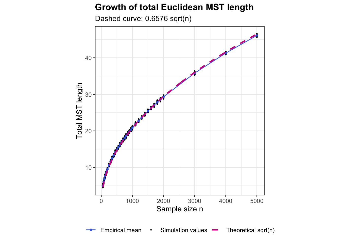
The result in Steele (1988) implies that, for bivariate uniform data, the total MST length grows at rate

\[ L_n \sim C\sqrt n, \]

for some positive constant \(C\).

To compare the simulations with this theoretical rate, I first calculate the empirical mean MST length for each sample size. I then estimate the multiplicative constant \(C\) by fitting the relationship

\[ L_n \approx C\sqrt n \]

through the origin.

Code
# Calculate the mean for each sample size
length_summary <- combined_results |>
  group_by(n) |>
  summarise(
    mean_length = mean(total_mst_length),
    .groups = "drop"
  )

# Estimate C in L_n = C * sqrt(n)
length_fit <- lm(
  mean_length ~ 0 + I(sqrt(n)),
  data = length_summary
)

C_hat <- unname(coef(length_fit)[1])

C_hat
[1] 0.6576368
Code
# Theoretical curve based on the fitted constant
theoretical_curve <- data.frame(
  n = seq(
    min(combined_results$n),
    max(combined_results$n),
    length.out = 500
  )
) |>
  mutate(
    theoretical_length = C_hat * sqrt(n)
  )

The following plot shows all individual simulation values of the total MST length. The blue line gives the empirical mean at each sample size, while the pink dashed line shows the fitted theoretical function

\[ \widehat C\sqrt n. \]

If the denominator follows the theoretical \(\sqrt n\) growth rate, the empirical mean should have approximately the same shape as this dashed curve.

Code
ggplot() +
  geom_point(
    data = combined_results,
    aes(
      x = n,
      y = total_mst_length,
      colour = "Simulation values"
    ),
    alpha = 0.7,
    size = 0.5
  ) +
  geom_line(
    data = length_summary,
    aes(
      x = n,
      y = mean_length,
      colour = "Empirical mean"
    ),
    linewidth = 0.5
  ) +
  geom_point(
    data = length_summary,
    aes(
      x = n,
      y = mean_length,
      colour = "Empirical mean"
    ),
    size = 1
  ) +
  geom_line(
    data = theoretical_curve,
    aes(
      x = n,
      y = theoretical_length,
      colour = "Theoretical sqrt(n)"
    ),
    linewidth = 1,
    linetype = "dashed"
  ) +
  scale_colour_manual(
    name = NULL,
    values = c(
      "Simulation values" = "black",
      "Empirical mean" = "royalblue",
      "Theoretical sqrt(n)" = "violetred"
    )
  ) +
  labs(
    x = "Sample size n",
    y = "Total MST length",
    title = "Growth of total Euclidean MST length",
    subtitle = paste0(
      "Dashed curve: ",
      round(C_hat, 4),
      " sqrt(n)"
    )
  ) +
  theme_bw() +
  theme(
    aspect.ratio = 1,
    plot.title = element_text(face = "bold"),
    legend.position = "bottom"
  )

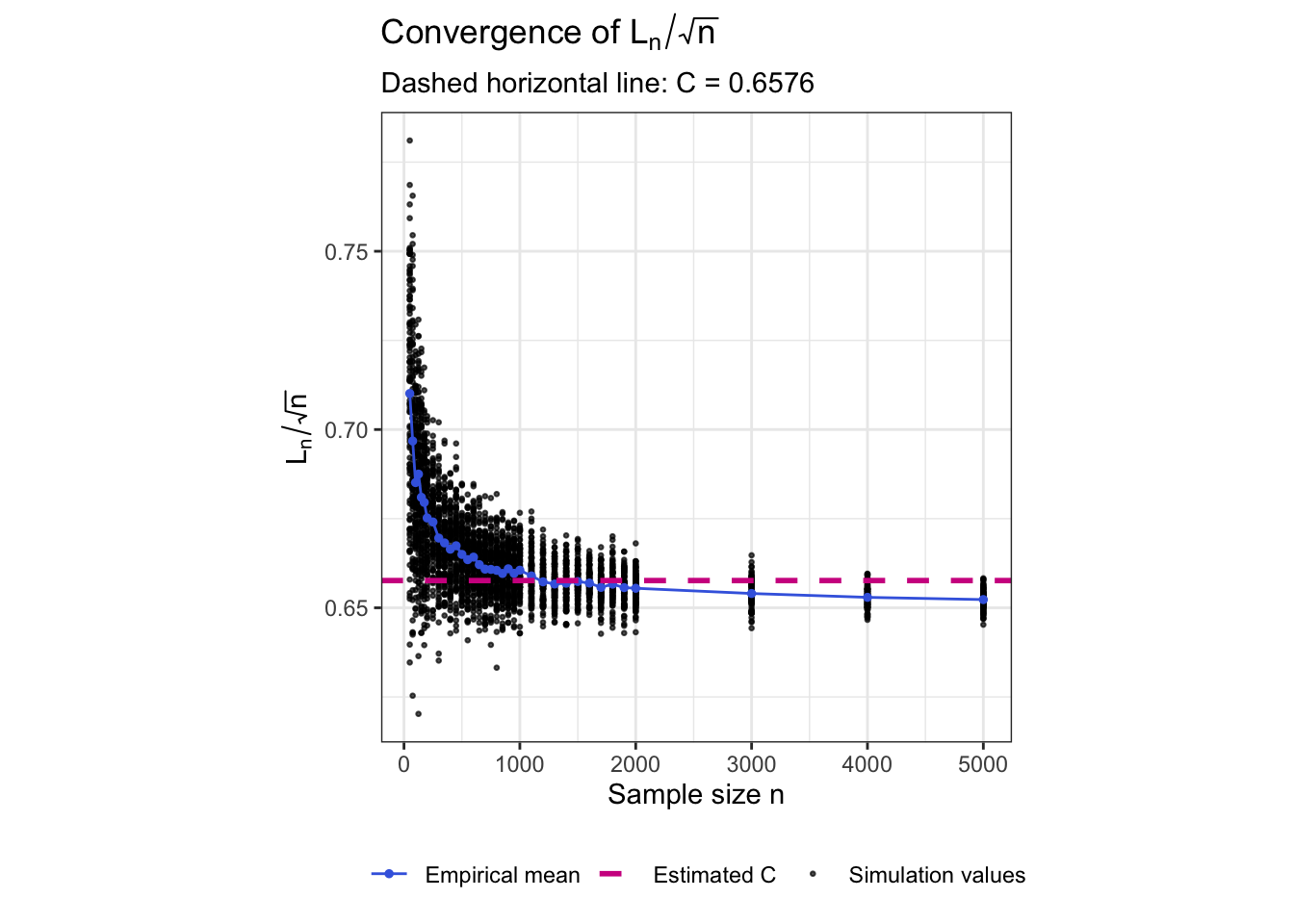
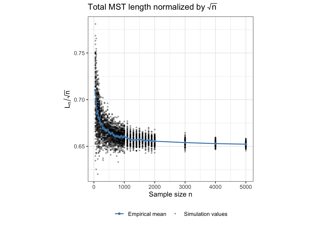
A second way to check the growth rate is to remove the proposed \(\sqrt n\) scaling. If

\[ L_n \sim C\sqrt n, \]

then

\[ \frac{L_n}{\sqrt n}\to C. \]

Therefore, if the theoretical rate is appropriate, the normalized MST length should become increasingly stable as the sample size grows.

The plot below shows the normalized value \(L_n/\sqrt n\) for every simulation. The blue line gives the empirical mean for each sample size, and the pink dashed line shows the same finite-sample estimate \(\widehat C\) obtained above.

Code
# Normalize total MST length by sqrt(n)
combined_results <- combined_results |>
  mutate(
    length_over_sqrtn = total_mst_length / sqrt(n)
  )

# Mean normalized length for each sample size
length_scaled_summary <- combined_results |>
  group_by(n) |>
  summarise(
    mean_length_over_sqrtn = mean(length_over_sqrtn),
    .groups = "drop"
  )

ggplot() +
  geom_point(
    data = combined_results,
    aes(
      x = n,
      y = length_over_sqrtn,
      colour = "Simulation values"
    ),
    alpha = 0.7,
    size = 0.5
  ) +
  geom_line(
    data = length_scaled_summary,
    aes(
      x = n,
      y = mean_length_over_sqrtn,
      colour = "Empirical mean"
    ),
    linewidth = 0.5
  ) +
  geom_point(
    data = length_scaled_summary,
    aes(
      x = n,
      y = mean_length_over_sqrtn,
      colour = "Empirical mean"
    ),
    size = 1
  ) +
  geom_hline(
    aes(
      yintercept = C_hat,
      colour = "Estimated C"
    ),
    linewidth = 1,
    linetype = "dashed"
  ) +
  scale_colour_manual(
    name = NULL,
    values = c(
      "Simulation values" = "black",
      "Empirical mean" = "royalblue",
      "Estimated C" = "violetred"
    )
  ) +
  labs(
    x = "Sample size n",
    y = expression(L[n] / sqrt(n)),
    title = expression("Convergence of " * L[n] / sqrt(n)),
    subtitle = paste0(
      "Dashed horizontal line: C = ",
      round(C_hat, 4)
    )
  ) +
  theme_bw() +
  theme(
    aspect.ratio = 1,
    plot.title = element_text(face = "bold"),
    legend.position = "bottom"
  )

Empirical check of the longest MST edge

The theoretical result for the numerator is not directly available for the weighted MST diameter used by stringy05. However, Penrose (1997) studies the longest single edge of the Euclidean minimum spanning tree. Let

\[ E_n = \max_{e \in T_n} |e|. \]

For independent uniform observations on the unit square, the longest MST edge has asymptotic scale

\[ E_n \asymp \sqrt{\frac{\log n}{n}}. \]

This is different from the actual stringy05 numerator, which is the weighted length of an entire path through the MST. Therefore, in the simulations I use the stored penrose_diameter variable to check the longest-edge result in Penrose (1997) separately.

For each sample size, the simulation was repeated 100 times. I first calculate the empirical mean longest-edge length for each value of \(n\).

Code
penrose_summary <- combined_results |>
  group_by(n) |>
  summarise(
    mean_penrose = mean(penrose_diameter),
    .groups = "drop"
  )

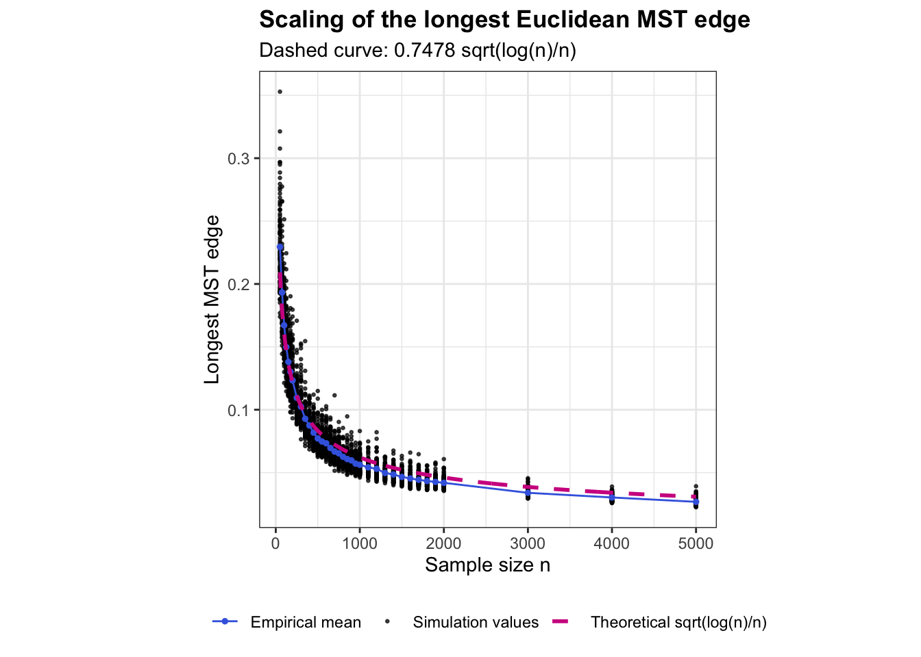
The result in Penrose (1997) suggests a relationship of the form

\[ E_n \approx A \sqrt{\frac{\log n}{n}}, \]

where \(A\) is a positive constant.

As with the denominator analysis, I estimate the constant \(A\) from the simulation values.

Code
penrose_fit <- lm(
  mean_penrose ~ 0 + I(sqrt(log(n) / n)),
  data = penrose_summary
)

A_hat <- unname(coef(penrose_fit)[1])

A_hat
[1] 0.7478367

The estimated value \(\widehat A\) is then used to construct the fitted theoretical curve

\[ \widehat A \sqrt{\frac{\log n}{n}}. \]

Code
penrose_theoretical_curve <- data.frame(
  n = seq(
    min(combined_results$n),
    max(combined_results$n),
    length.out = 500
  )
) |>
  mutate(
    theoretical_penrose =
      A_hat * sqrt(log(n) / n)
  )

The following plot shows all individual simulation values of the longest MST edge. The blue line shows the empirical mean for each sample size, while the pink dashed curve shows the fitted theoretical function

\[ \widehat A \sqrt{\frac{\log n}{n}}. \]

If the simulations are consistent with Penrose (1997), the empirical longest-edge values should decrease with approximately the same shape as the theoretical curve.

Code
ggplot() +
  geom_point(
    data = combined_results,
    aes(
      x = n,
      y = penrose_diameter,
      colour = "Simulation values"
    ),
    alpha = 0.7,
    size = 0.5
  ) +
  geom_line(
    data = penrose_summary,
    aes(
      x = n,
      y = mean_penrose,
      colour = "Empirical mean"
    ),
    linewidth = 0.5
  ) +
  geom_point(
    data = penrose_summary,
    aes(
      x = n,
      y = mean_penrose,
      colour = "Empirical mean"
    ),
    size = 1
  ) +
  geom_line(
    data = penrose_theoretical_curve,
    aes(
      x = n,
      y = theoretical_penrose,
      colour = "Theoretical sqrt(log(n)/n)"
    ),
    linewidth = 1,
    linetype = "dashed"
  ) +
  scale_colour_manual(
    name = NULL,
    values = c(
      "Simulation values" = "black",
      "Empirical mean" = "royalblue",
      "Theoretical sqrt(log(n)/n)" = "violetred"
    )
  ) +
  labs(
    x = "Sample size n",
    y = "Longest MST edge",
    title = "Scaling of the longest Euclidean MST edge",
    subtitle = paste0(
      "Dashed curve: ",
      round(A_hat, 4),
      " sqrt(log(n)/n)"
    )
  ) +
  theme_bw() +
  theme(
    aspect.ratio = 1,
    plot.title = element_text(face = "bold"),
    legend.position = "bottom"
  )

Does the stringy05 numerator follow the Penrose rate?

The previous analysis verified the theoretical result for the longest single MST edge. However, the numerator of stringy05 is not the longest individual edge. It is the weighted MST diameter, which is the total Euclidean length of the longest path through the MST.

The next empirical question is whether the weighted diameter nevertheless follows a similar scaling,

\[ D_n \approx B\sqrt{\frac{\log n}{n}}, \]

for some constant \(B\).

Code
stringy_diameter_summary <- combined_results |>
  group_by(n) |>
  summarise(
    mean_stringy_diameter = mean(stringy_diameter),
    .groups = "drop"
  )

To compare the weighted diameter with the functional form from Penrose (1997), I fit

\[ D_n \approx B\sqrt{\frac{\log n}{n}} \]

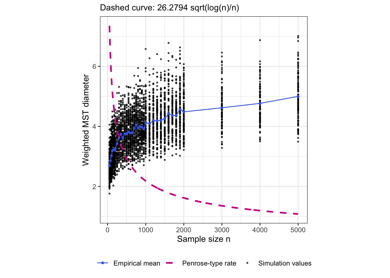
The purpose is to test whether the shape and rate of the weighted diameter are consistent with the rate from Penrose (1997).

Code
stringy_diameter_fit <- lm(
  stringy_diameter ~ 0 + I(sqrt(log(n) / n)),
  data = combined_results
)

B_hat <- unname(coef(stringy_diameter_fit)[1])

B_hat
[1] 26.27941
Code
stringy_theoretical_curve <- data.frame(
  n = seq(
    min(combined_results$n),
    max(combined_results$n),
    length.out = 500
  )
) |>
  mutate(
    theoretical_stringy_diameter =
      B_hat * sqrt(log(n) / n)
  )

The following plot compares all simulated weighted MST diameters with the theoretical boundary from Penrose (1997).

Code
ggplot() +
  geom_point(
    data = combined_results,
    aes(
      x = n,
      y = stringy_diameter,
      colour = "Simulation values"
    ),
    alpha = 0.7,
    size = 0.5
  ) +
  geom_line(
    data = stringy_diameter_summary,
    aes(
      x = n,
      y = mean_stringy_diameter,
      colour = "Empirical mean"
    ),
    linewidth = 0.5
  ) +
  geom_point(
    data = stringy_diameter_summary,
    aes(
      x = n,
      y = mean_stringy_diameter,
      colour = "Empirical mean"
    ),
    size = 1
  ) +
  geom_line(
    data = stringy_theoretical_curve,
    aes(
      x = n,
      y = theoretical_stringy_diameter,
      colour = "Penrose-type rate"
    ),
    linewidth = 1,
    linetype = "dashed"
  ) +
  scale_colour_manual(
    name = NULL,
    values = c(
      "Simulation values" = "black",
      "Empirical mean" = "royalblue",
      "Penrose-type rate" = "violetred"
    )
  ) +
  labs(
    x = "Sample size n",
    y = "Weighted MST diameter",
    subtitle = paste0(
      "Dashed curve: ",
      round(B_hat, 4),
      " sqrt(log(n)/n)"
    )
  ) +
  theme_bw() +
  theme(
    aspect.ratio = 1,
    plot.title = element_text(face = "bold"),
    legend.position = "bottom"
  )

Addario-Berry, Broutin and Reed: an \(n^{1/3}\) MST-diameter benchmark

Addario-Berry, Broutin, and Reed (2006) study a different random minimum-spanning-tree model. They begin with the complete graph \(K_n\), assign independent and identically distributed continuous weights to all edges, and construct the minimum-weight spanning tree. Their main result is

\[ \mathbb{E}\{\operatorname{diam}(T_n)\} = \Theta(n^{1/3}). \]

There are two important differences from my setting:

  1. Randomness of the edge weights. In Addario-Berry, Broutin, and Reed (2006), the edge weights of \(K_n\) are i.i.d. In my Euclidean MST, the edge weights are distances between random points in \(\mathbb{R}^2\), so the pairwise edge weights are geometrically constrained and are not independent.
  2. Definition of diameter. Their diameter is the ordinary graph diameter, based on graph distance along the tree. My stringy05 numerator is a weighted Euclidean diameter, where the Euclidean edge lengths are summed along the longest weighted path.

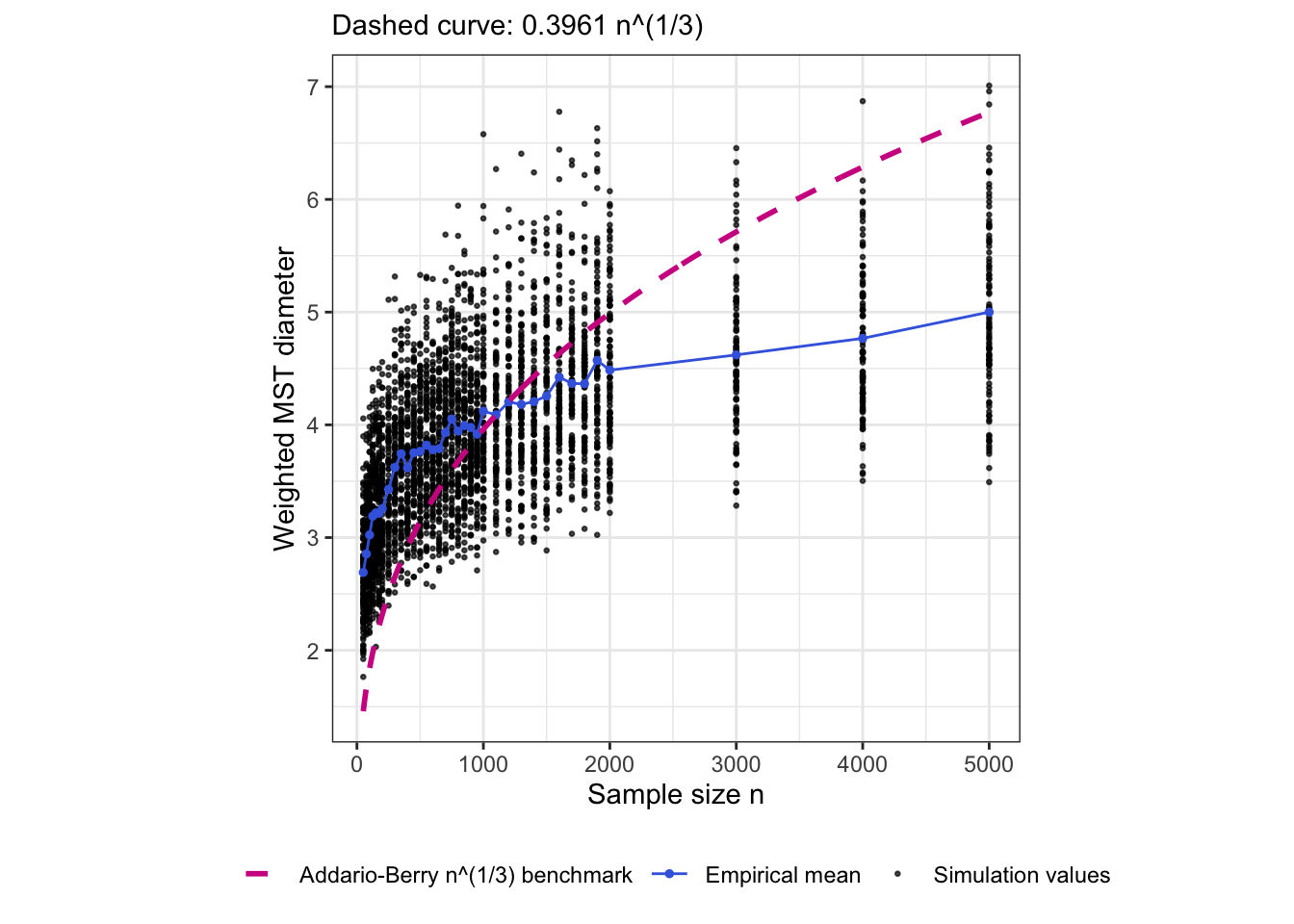
To see whether the empirical weighted diameter has anything resembling the same growth shape, I fit the benchmark

\[ D_n \approx C_{\mathrm{ABR}} n^{1/3}, \]

to the empirical weighted-diameter means.

Code
abr_fit <- lm(
  mean_stringy_diameter ~ 0 + I(n^(1/3)),
  data = stringy_diameter_summary
)

C_ABR_hat <- unname(coef(abr_fit)[1])


abr_theoretical_curve <- data.frame(
  n = seq(
    min(combined_results$n),
    max(combined_results$n),
    length.out = 500
  )
) |>
  mutate(
    abr_n13_benchmark = C_ABR_hat * n^(1/3)
  )

The following plot shows the same simulated weighted MST diameters used in the previous section, but now compares them with the fitted \(n^{1/3}\) benchmark from Addario-Berry, Broutin, and Reed (2006).

Code
ggplot() +
  geom_point(
    data = combined_results,
    aes(
      x = n,
      y = stringy_diameter,
      colour = "Simulation values"
    ),
    alpha = 0.7,
    size = 0.5
  ) +
  geom_line(
    data = stringy_diameter_summary,
    aes(
      x = n,
      y = mean_stringy_diameter,
      colour = "Empirical mean"
    ),
    linewidth = 0.5
  ) +
  geom_point(
    data = stringy_diameter_summary,
    aes(
      x = n,
      y = mean_stringy_diameter,
      colour = "Empirical mean"
    ),
    size = 1
  ) +
  geom_line(
    data = abr_theoretical_curve,
    aes(
      x = n,
      y = abr_n13_benchmark,
      colour = "Addario-Berry n^(1/3) benchmark"
    ),
    linewidth = 1,
    linetype = "dashed"
  ) +
  scale_colour_manual(
    name = NULL,
    values = c(
      "Simulation values" = "black",
      "Empirical mean" = "royalblue",
      "Addario-Berry n^(1/3) benchmark" = "violetred"
    )
  ) +
  labs(
    x = "Sample size n",
    y = "Weighted MST diameter",
    subtitle = paste0(
      "Dashed curve: ",
      round(C_ABR_hat, 4),
      " n^(1/3)"
    )
  ) +
  theme_bw() +
  theme(
    aspect.ratio = 1,
    plot.title = element_text(face = "bold"),
    legend.position = "bottom"
  )

Empirical check of the Addario-Berry hop-diameter growth rate

Addario-Berry, Broutin, and Reed (2006) study the graph diameter of a random minimum spanning tree, where distance is measured by the number of edges along a path. They show that the expected diameter grows at rate

\[ E(H_n) = \Theta(n^{1/3}), \]

where \(H_n\) denotes the hop diameter.

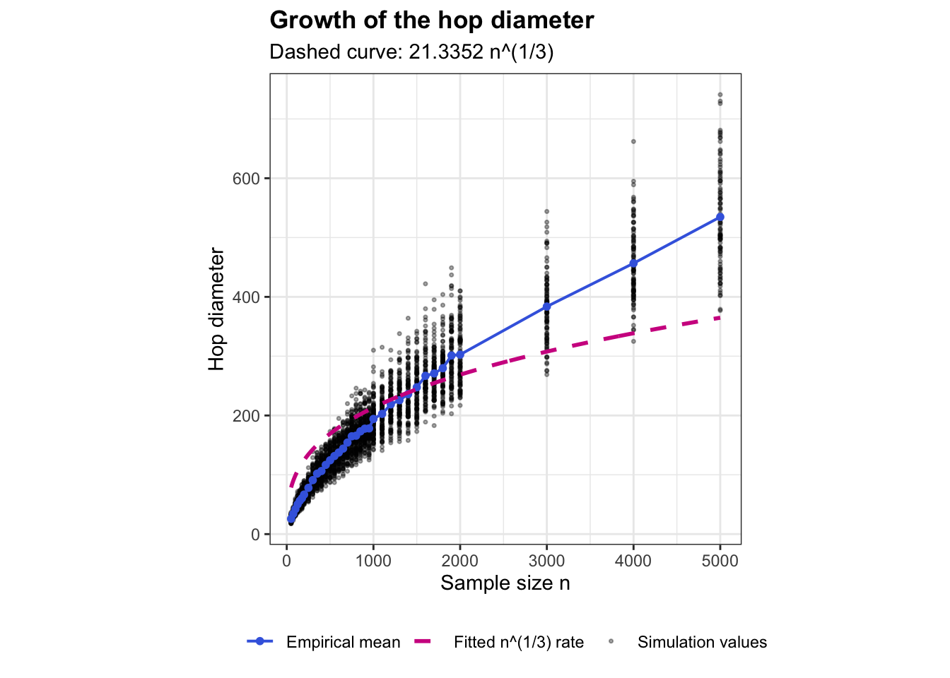
Although their random-MST model differs from the Euclidean MST considered here, the \(n^{1/3}\) rate can be used as a comparison benchmark.

For each sample size, I simulated 100 independent bivariate uniform samples and recorded the unweighted hop diameter of the resulting Euclidean MST.

Code
addario_files <- c(
  "addario_uniform_50_175.csv",
  "addario_uniform_200_500.csv",
  "addario_uniform_550_800.csv",
  "addario_uniform_850_1000.csv",
  "addario_uniform_1100_2000.csv",
  "addario_uniform_3000_5000.csv"
)

addario_results <- map_dfr(
  addario_files,
  ~ read_csv(.x, show_col_types = FALSE)
) |>
  arrange(n, simulation_run)

For each value of \(n\), the empirical mean hop diameter is

\[ \overline H_n = \frac{1}{100} \sum_{b=1}^{100} H_{n,b}. \]

Code
addario_summary <- addario_results |>
  group_by(n) |>
  summarise(
    mean_hop_diameter = mean(addario_hop_diameter),
    .groups = "drop"
  )

Fit the \(n^{1/3}\) growth rate

The theorem specifies the growth rate but not an exact multiplicative constant. Therefore, I estimate the constant \(C\) in

\[ E(H_n) \approx Cn^{1/3} \]

from the simulated mean diameters.

Code
addario_fit <- lm(
  mean_hop_diameter ~ 0 + I(n^(1/3)),
  data = addario_summary
)

C_addario <- unname(coef(addario_fit)[1])

C_addario
[1] 21.33516

Then create the theoretical curve:

Code
addario_curve <- data.frame(
  n = seq(
    min(addario_results$n),
    max(addario_results$n),
    length.out = 500
  )
) |>
  mutate(
    theoretical_hop_diameter =
      C_addario * n^(1/3)
  )

Plotting hop diameter and \(n^{1/3}\) growth

Code
ggplot() +
  geom_point(
    data = addario_results,
    aes(
      x = n,
      y = addario_hop_diameter,
      colour = "Simulation values"
    ),
    alpha = 0.35,
    size = 0.6
  ) +
  
  geom_line(
    data = addario_summary,
    aes(
      x = n,
      y = mean_hop_diameter,
      colour = "Empirical mean"
    ),
    linewidth = 0.7
  ) +
  
  geom_point(
    data = addario_summary,
    aes(
      x = n,
      y = mean_hop_diameter,
      colour = "Empirical mean"
    ),
    size = 1.4
  ) +
  
  geom_line(
    data = addario_curve,
    aes(
      x = n,
      y = theoretical_hop_diameter,
      colour = "Fitted n^(1/3) rate"
    ),
    linewidth = 1,
    linetype = "dashed"
  ) +
  
  scale_colour_manual(
    name = NULL,
    values = c(
      "Simulation values" = "black",
      "Empirical mean" = "royalblue",
      "Fitted n^(1/3) rate" = "violetred"
    )
  ) +
  
  labs(
    x = "Sample size n",
    y = "Hop diameter",
    title = "Growth of the hop diameter",
    subtitle = paste0(
      "Dashed curve: ",
      round(C_addario, 4),
      " n^(1/3)"
    )
  ) +
  theme_bw() +
  theme(
    aspect.ratio = 1,
    plot.title = element_text(face = "bold"),
    legend.position = "bottom"
  )

Combining the Penrose and Addario-Berry rates

For a weighted tree,

\[ D_n \le H_n M_n, \]

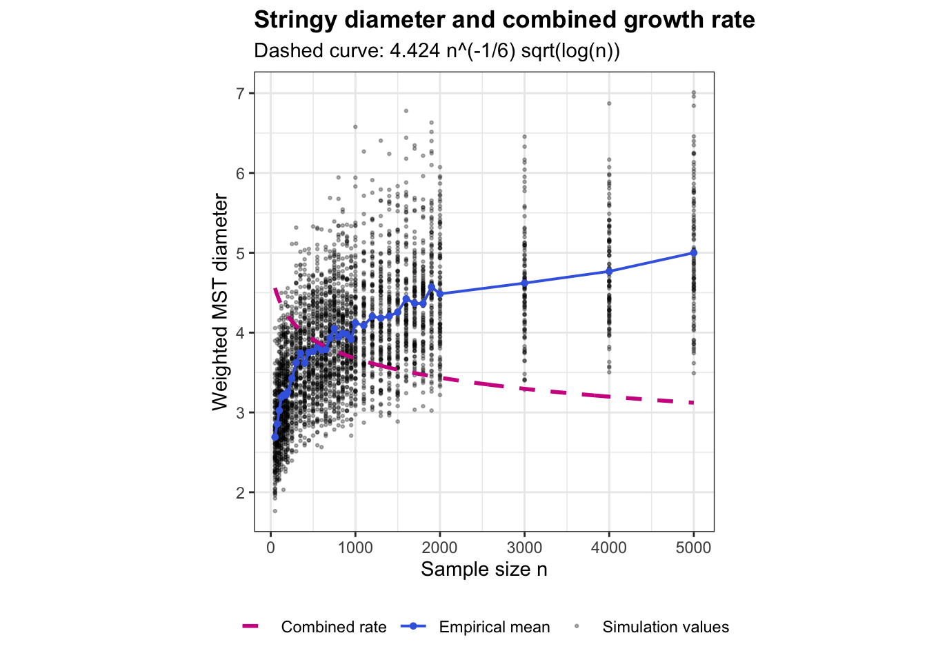
where \(H_n\) is the hop diameter and \(M_n\) is the largest edge weight. This motivates combining the \(n^{1/3}\) rate from Addario-Berry, Broutin, and Reed (2006) with the Penrose rate \(\sqrt{\log(n)/n}\):

\[ g(n) = n^{1/3}\sqrt{\frac{\log n}{n}} = n^{-1/6}\sqrt{\log n}. \]

Code
comparison_summary <- combined_results |>
  group_by(n) |>
  summarise(
    mean_stringy_diameter = mean(stringy_diameter),
    .groups = "drop"
  ) |>
  mutate(
    combined_rate =
      n^(1/3) * sqrt(log(n) / n)
  )

Estimate one constant \(C\) so that

\[ D_n \approx Cg(n). \]

Code
multiplied_fit <- lm(
  mean_stringy_diameter ~ 0 + combined_rate,
  data = comparison_summary
)

C_multiplied <- unname(coef(multiplied_fit)[1])

C_multiplied
[1] 4.424021

Create the smooth benchmark curve:

Code
multiplied_curve <- data.frame(
  n = seq(
    min(combined_results$n),
    max(combined_results$n),
    length.out = 500
  )
) |>
  mutate(
    theoretical_product =
      C_multiplied *
      n^(1/3) *
      sqrt(log(n) / n)
  )

Then plot only the simulations, their mean, and the combined rate:

Code
ggplot() +
  
  geom_point(
    data = combined_results,
    aes(
      x = n,
      y = stringy_diameter,
      colour = "Simulation values"
    ),
    alpha = 0.3,
    size = 0.5
  ) +
  
  geom_line(
    data = comparison_summary,
    aes(
      x = n,
      y = mean_stringy_diameter,
      colour = "Empirical mean"
    ),
    linewidth = 0.7
  ) +
  
  geom_point(
    data = comparison_summary,
    aes(
      x = n,
      y = mean_stringy_diameter,
      colour = "Empirical mean"
    ),
    size = 1.2
  ) +
  
  geom_line(
    data = multiplied_curve,
    aes(
      x = n,
      y = theoretical_product,
      colour = "Combined rate"
    ),
    linewidth = 1,
    linetype = "dashed"
  ) +
  
  scale_colour_manual(
    name = NULL,
    values = c(
      "Simulation values" = "black",
      "Empirical mean" = "royalblue",
      "Combined rate" = "violetred"
    )
  ) +
  
  labs(
    x = "Sample size n",
    y = "Weighted MST diameter",
    title = "Stringy diameter and combined growth rate",
    subtitle = paste0(
      "Dashed curve: ",
      round(C_multiplied, 4),
      " n^(-1/6) sqrt(log(n))"
    )
  ) +
  
  theme_bw() +
  theme(
    aspect.ratio = 1,
    plot.title = element_text(face = "bold"),
    legend.position = "bottom"
  )

Exploring the ratio after normalizing the denominator

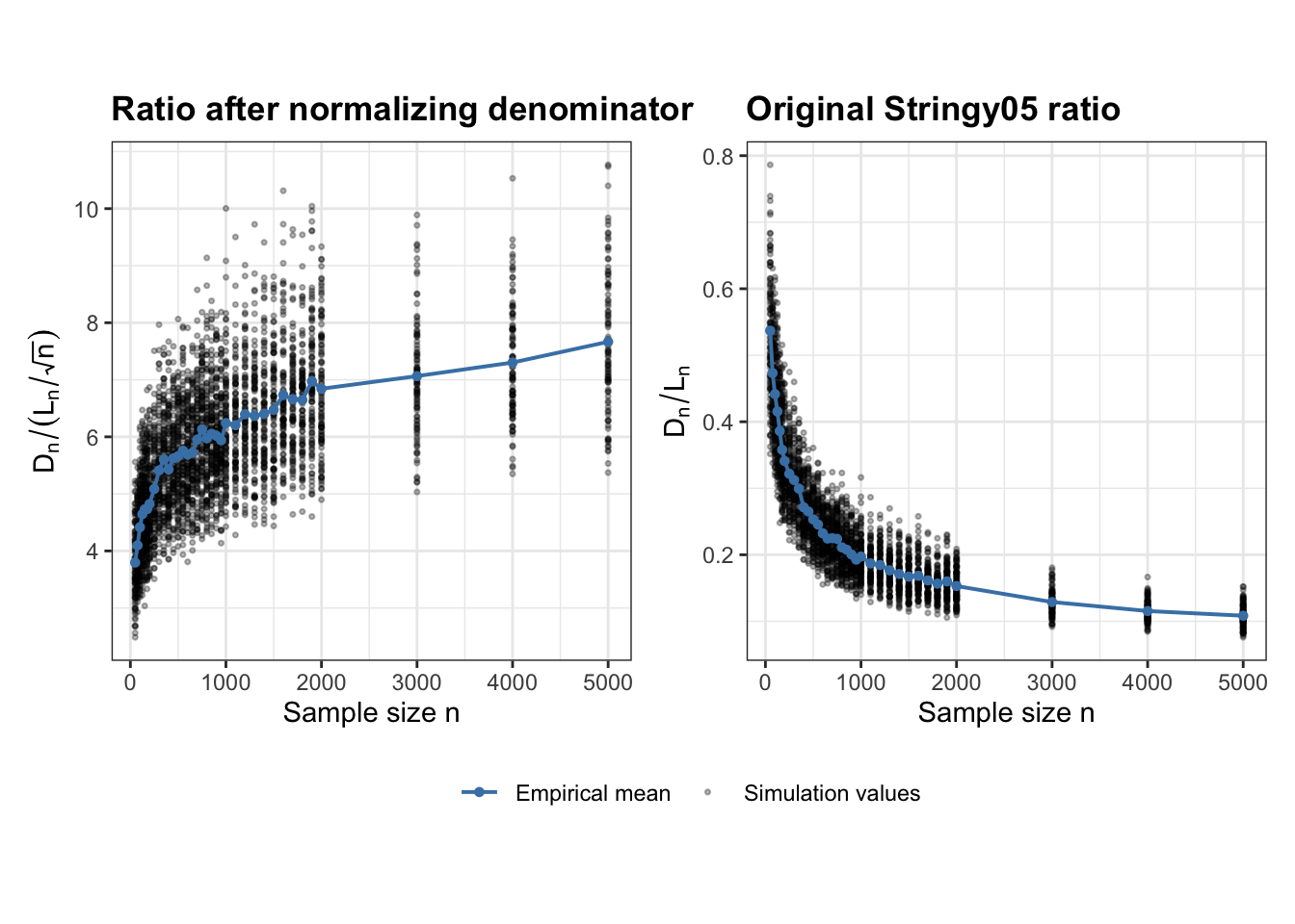
For bivariate uniform data, the total Euclidean MST length \(L_n\), has a theoretically established \(\sqrt{n}\) growth rate. More specifically, the result gives almost-sure convergence of \(L_n/\sqrt{n}\) to a positive constant. We therefore use this known rate to remove the sample-size growth of the denominator while leaving the weighted MST diameter \(D_n\) unchanged, since no corresponding theoretical growth rate is currently available for the numerator. For each individual simulation, we calculate

\[ R_n^* = \frac{D_n}{L_n/\sqrt{n}}. \]

The purpose is to examine how the numerator behaves relative to the theoretically normalized denominator and whether the resulting empirical distribution shows any tendency to stabilize as \(n\) increases.

Code
uniform_files <- c(
  "stringy05_uniform_50_175.csv",
  "stringy05_uniform_200_500.csv",
  "stringy05_uniform_550_800.csv",
  "stringy05_uniform_850_1000.csv",
  "stringy05_uniform_1100_2000.csv",
  "stringy05_uniform_3000_5000.csv"
)

uniform_results <- map_dfr(
  uniform_files,
  ~ read_csv(.x, show_col_types = FALSE)
) |>
  arrange(n, simulation_run)


uniform_ratio_results <- uniform_results |>
  mutate(
    # Theoretical normalization of denominator
    normalized_mst_length = total_mst_length / sqrt(n),

    # Numerator remains same
    ratio_denominator_scaled =
      stringy_diameter / normalized_mst_length
  )

ratio_summary <- uniform_ratio_results |>
  group_by(n) |>
  summarise(
    mean_ratio = mean(
      ratio_denominator_scaled,
      na.rm = TRUE
    ),
    .groups = "drop"
  )
Code
# Normalize the denominator by sqrt(n)
length_scaled_results <- uniform_ratio_results |>
  mutate(
    length_over_sqrtn = total_mst_length / sqrt(n)
  )

length_scaled_summary <- length_scaled_results |>
  group_by(n) |>
  summarise(
    mean_length_sqrtn =
      mean(length_over_sqrtn, na.rm = TRUE),
    .groups = "drop"
  )

# Plot L_n / sqrt(n)
ggplot() +
  geom_point(
    data = length_scaled_results,
    aes(
      x = n,
      y = length_over_sqrtn,
      colour = "Simulation values"
    ),
    alpha = 0.3,
    size = 0.6
  ) +
  geom_line(
    data = length_scaled_summary,
    aes(
      x = n,
      y = mean_length_sqrtn,
      colour = "Empirical mean"
    ),
    linewidth = 0.7
  ) +
  geom_point(
    data = length_scaled_summary,
    aes(
      x = n,
      y = mean_length_sqrtn,
      colour = "Empirical mean"
    ),
    size = 1.2
  ) +
  scale_colour_manual(
    name = NULL,
    values = c(
      "Simulation values" = "black",
      "Empirical mean" = "steelblue"
    )
  ) +
  labs(
    x = "Sample size n",
    y = expression(L[n] / sqrt(n)),
    title = expression(
      "Total MST length normalized by " * sqrt(n)
    )
  ) +
  theme_bw() +
  theme(
    aspect.ratio = 1,
    plot.title = element_text(face = "bold"),
    legend.position = "bottom"
  )

Plot the normalized ratio and the original ratio side by side

Code
# original Stringy05 ratio
uniform_ratio_results <- uniform_ratio_results |>
  mutate(
    original_ratio = stringy_diameter / total_mst_length
  )

original_ratio_summary <- uniform_ratio_results |>
  group_by(n) |>
  summarise(
    mean_original_ratio = mean(original_ratio, na.rm = TRUE),
    .groups = "drop"
  )

# --------------------------------------------------
# Left: ratio after normalizing denominator

p_scaled <- ggplot() +
  geom_point(
    data = uniform_ratio_results,
    aes(
      x = n,
      y = ratio_denominator_scaled,
      colour = "Simulation values"
    ),
    alpha = 0.3,
    size = 0.6
  ) +
  geom_line(
    data = ratio_summary,
    aes(
      x = n,
      y = mean_ratio,
      colour = "Empirical mean"
    ),
    linewidth = 0.7
  ) +
  geom_point(
    data = ratio_summary,
    aes(
      x = n,
      y = mean_ratio,
      colour = "Empirical mean"
    ),
    size = 1.2
  ) +
  scale_colour_manual(
    name = NULL,
    values = c(
      "Simulation values" = "black",
      "Empirical mean" = "steelblue"
    )
  ) +
  labs(
    x = "Sample size n",
    y = expression(
      D[n] / (L[n] / sqrt(n))
    ),
    title = "Ratio after normalizing denominator"
  ) +
  theme_bw() +
  theme(
    aspect.ratio = 1,
    plot.title = element_text(face = "bold"),
    legend.position = "bottom"
  )


# --------------------------------------------------
# Right: original Stringy05 ratio

p_original <- ggplot() +
  geom_point(
    data = uniform_ratio_results,
    aes(
      x = n,
      y = original_ratio,
      colour = "Simulation values"
    ),
    alpha = 0.3,
    size = 0.6
  ) +
  geom_line(
    data = original_ratio_summary,
    aes(
      x = n,
      y = mean_original_ratio,
      colour = "Empirical mean"
    ),
    linewidth = 0.7
  ) +
  geom_point(
    data = original_ratio_summary,
    aes(
      x = n,
      y = mean_original_ratio,
      colour = "Empirical mean"
    ),
    size = 1.2
  ) +
  scale_colour_manual(
    name = NULL,
    values = c(
      "Simulation values" = "black",
      "Empirical mean" = "steelblue"
    )
  ) +
  labs(
    x = "Sample size n",
    y = expression(D[n] / L[n]),
    title = "Original Stringy05 ratio"
  ) +
  theme_bw() +
  theme(
    aspect.ratio = 1,
    plot.title = element_text(face = "bold"),
    legend.position = "bottom"
  )


p_scaled + p_original +
  plot_layout(guides = "collect") &
  theme(legend.position = "bottom")

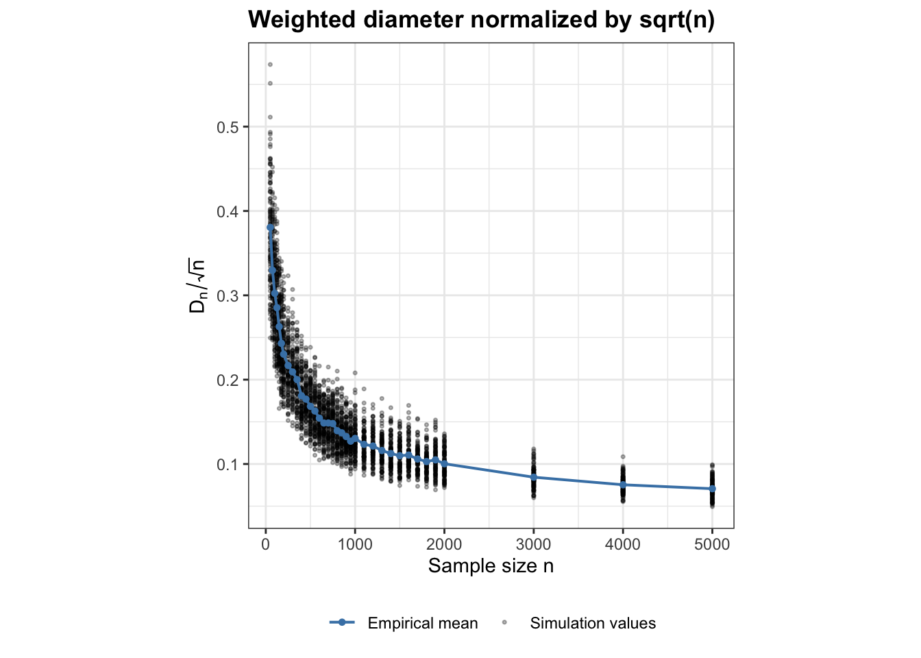
Next, we examine the weighted MST diameter \(D_n\), which forms the numerator of stringy05, relative to the same \(\sqrt{n}\) scale used for the denominator. Since no theoretical growth rate is currently available for \(D_n\), dividing it by \(\sqrt{n}\) is used only as an empirical comparison to determine whether the numerator grows on the same scale as the total MST length.

Code
# Normalize the numerator by sqrt(n)

uniform_ratio_results <- uniform_ratio_results |>
  mutate(
    normalized_diameter =
      stringy_diameter / sqrt(n)
  )

diameter_scaled_summary <- uniform_ratio_results |>
  group_by(n) |>
  summarise(
    mean_normalized_diameter =
      mean(normalized_diameter, na.rm = TRUE),
    .groups = "drop"
  )

Normalized weighted diameter

Code
p_diameter_scaled <- ggplot() +
  geom_point(
    data = uniform_ratio_results,
    aes(
      x = n,
      y = normalized_diameter,
      colour = "Simulation values"
    ),
    alpha = 0.3,
    size = 0.6
  ) +
  geom_line(
    data = diameter_scaled_summary,
    aes(
      x = n,
      y = mean_normalized_diameter,
      colour = "Empirical mean"
    ),
    linewidth = 0.7
  ) +
  geom_point(
    data = diameter_scaled_summary,
    aes(
      x = n,
      y = mean_normalized_diameter,
      colour = "Empirical mean"
    ),
    size = 1.2
  ) +
  scale_colour_manual(
    name = NULL,
    values = c(
      "Simulation values" = "black",
      "Empirical mean" = "steelblue"
    )
  ) +
  labs(
    x = "Sample size n",
    y = expression(D[n] / sqrt(n)),
    title = "Weighted diameter normalized by sqrt(n)"
  ) +
  theme_bw() +
  theme(
    aspect.ratio = 1,
    plot.title = element_text(face = "bold"),
    legend.position = "bottom"
  )

p_diameter_scaled

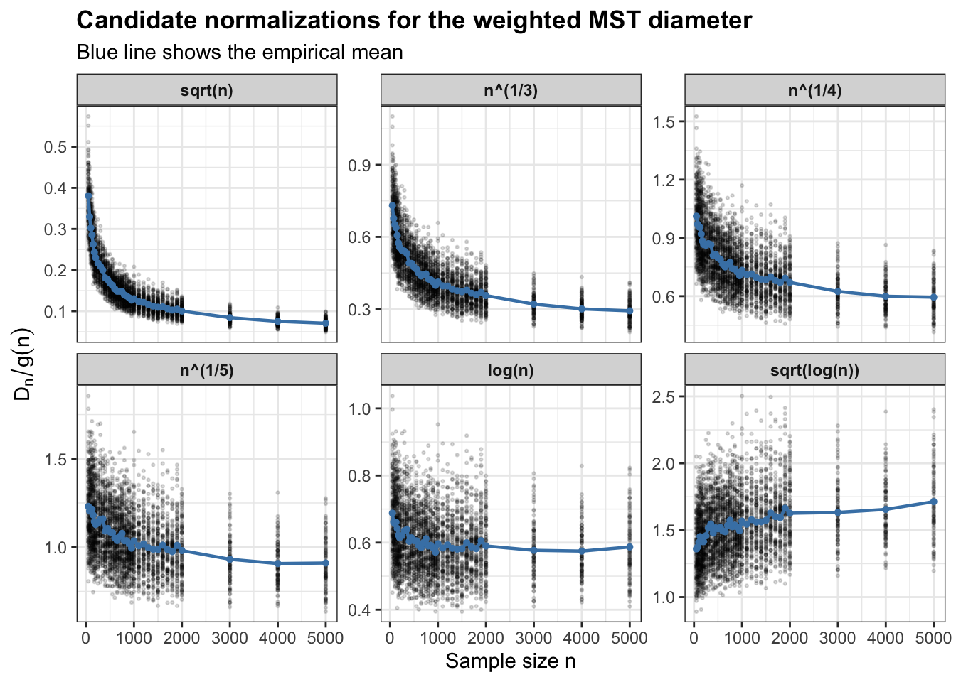
Since normalizing the weighted MST diameter by \(\sqrt n\) produces a clear decreasing trend, the simulations suggest that the diameter grows more slowly than \(\sqrt n\). We therefore compare several slower candidate functions of sample size. For each candidate rate \(g(n)\), the weighted diameter is normalized as \(D_n/g(n)\). A suitable empirical scaling should remove most of the sample-size trend, so that the normalized diameter becomes approximately stable for large \(n\).

Code
library(tidyr)
# Compare candidate growth rates for the diameter
# --------------------------------------------------

diameter_rate_results <- uniform_ratio_results |>
  transmute(
    n,
    simulation_run,
    stringy_diameter,

    `sqrt(n)`      = stringy_diameter / sqrt(n),
    `n^(1/3)`      = stringy_diameter / n^(1/3),
    `n^(1/4)`      = stringy_diameter / n^(1/4),
    `n^(1/5)`      = stringy_diameter / n^(1/5),
    `log(n)`       = stringy_diameter / log(n),
    `sqrt(log(n))` = stringy_diameter / sqrt(log(n))
  ) |>
  pivot_longer(
    cols = -c(n, simulation_run, stringy_diameter),
    names_to = "normalization",
    values_to = "normalized_diameter"
  )

diameter_rate_results <- diameter_rate_results |>
  mutate(
    normalization = factor(
      normalization,
      levels = c(
        "sqrt(n)",
        "n^(1/3)",
        "n^(1/4)",
        "n^(1/5)",
        "log(n)",
        "sqrt(log(n))"
      )
    )
  )

Calculate the mean after normalizing each individual simulation:

Code
diameter_rate_summary <- diameter_rate_results |>
  group_by(n, normalization) |>
  summarise(
    mean_normalized_diameter =
      mean(normalized_diameter, na.rm = TRUE),
    .groups = "drop"
  )

Plot all candidate normalizations

Code
ggplot() +
  geom_point(
    data = diameter_rate_results,
    aes(
      x = n,
      y = normalized_diameter
    ),
    alpha = 0.15,
    size = 0.45
  ) +
  geom_line(
    data = diameter_rate_summary,
    aes(
      x = n,
      y = mean_normalized_diameter
    ),
    colour = "steelblue",
    linewidth = 0.8
  ) +
  geom_point(
    data = diameter_rate_summary,
    aes(
      x = n,
      y = mean_normalized_diameter
    ),
    colour = "steelblue",
    size = 1.1
  ) +
  facet_wrap(
    ~ normalization,
    scales = "free_y",
    ncol = 3
  ) +
  labs(
    x = "Sample size n",
    y = expression(D[n] / g(n)),
    title = "Candidate normalizations for the weighted MST diameter",
    subtitle = "Blue line shows the empirical mean"
  ) +
  theme_bw() +
  theme(
    plot.title = element_text(face = "bold"),
    strip.text = element_text(face = "bold")
  )

The normalized diameter continues to decrease under \(\sqrt{n}\), \(n^{1/3}\), and \(n^{1/4}\), indicating that these functions increase faster than the empirical weighted-diameter growth. In contrast, normalization by \(\sqrt{\log n}\) produces an increasing trend, suggesting that this rate is too slow. The \(n^{1/5}\) and \(\log n\) normalizations give the flattest curves, with \(\log n\) appearing particularly stable at larger sample sizes. Since these comparisons are empirical, the next step is to quantify stability rather than selecting a rate only by visual inspection.

1. Compare slopes after \(n=1000\)

A good candidate should have a slope close to zero.

Code
rate_slopes <- diameter_rate_summary |>
  filter(n >= 1000) |>
  group_by(normalization) |>
  summarise(
    slope = coef(
      lm(mean_normalized_diameter ~ n)
    )[2],
    .groups = "drop"
  ) |>
  mutate(
    abs_slope = abs(slope)
  ) |>
  arrange(abs_slope)

rate_slopes
# A tibble: 6 × 3
  normalization       slope  abs_slope
  <fct>               <dbl>      <dbl>
1 log(n)        -0.00000240 0.00000240
2 sqrt(n)       -0.0000143  0.0000143 
3 n^(1/3)       -0.0000290  0.0000290 
4 n^(1/5)       -0.0000308  0.0000308 
5 n^(1/4)       -0.0000338  0.0000338 
6 sqrt(log(n))   0.0000350  0.0000350 

The smallest abs_slope (\(log(n)\)) is the flattest candidate.

2. Compare relative change over large \(n\)

Code
rate_stability <- diameter_rate_summary |>
  filter(n >= 1000) |>
  group_by(normalization) |>
  summarise(
    min_value = min(mean_normalized_diameter),
    max_value = max(mean_normalized_diameter),
    mean_value = mean(mean_normalized_diameter),

    relative_range =
      (max_value - min_value) / mean_value,

    .groups = "drop"
  ) |>
  arrange(relative_range)

rate_stability
# A tibble: 6 × 5
  normalization min_value max_value mean_value relative_range
  <fct>             <dbl>     <dbl>      <dbl>          <dbl>
1 log(n)           0.575      0.606      0.587         0.0524
2 sqrt(log(n))     1.55       1.71       1.61          0.105 
3 n^(1/5)          0.908      1.04       0.982         0.130 
4 n^(1/4)          0.595      0.733      0.675         0.205 
5 n^(1/3)          0.292      0.412      0.363         0.330 
6 sqrt(n)          0.0707     0.130      0.105         0.569 

Among the candidate functions considered, \(\log n\) provides the most stable empirical normalization over \(n\ge1000\).

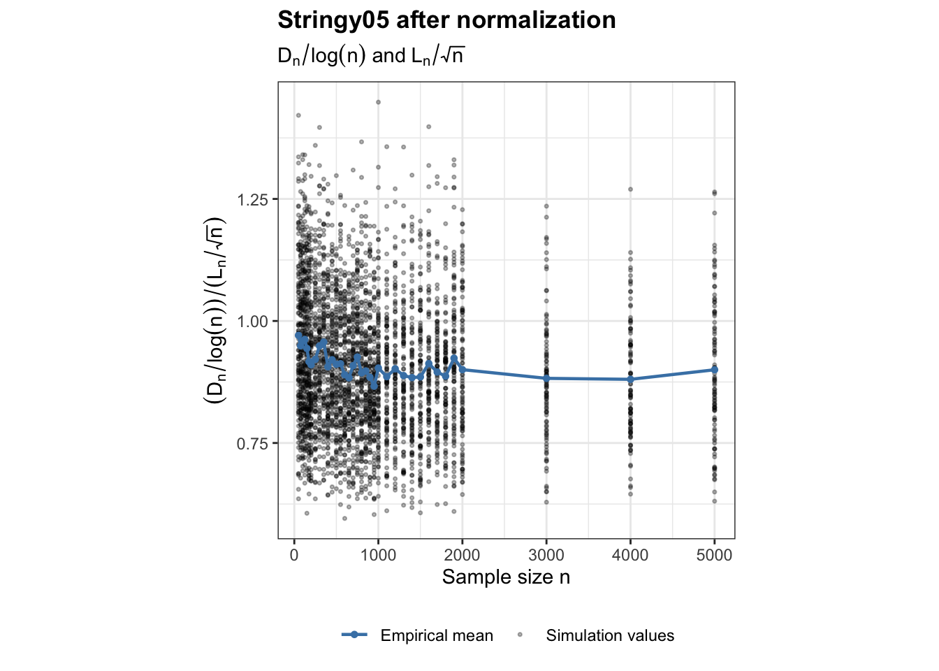
The previous analysis suggested that \(\log n\) provides the most stable empirical normalization for the weighted MST diameter \(D_n\), while the total MST length \(L_n\) has a theoretically established \(\sqrt n\) scaling. We therefore normalize the numerator and denominator separately using these two rates.

Code
# Normalize numerator by log(n)
# and denominator by sqrt(n)

normalized_ratio_results <- uniform_results |>
  mutate(
    diameter_over_logn =
      stringy_diameter / log(n),

    length_over_sqrtn =
      total_mst_length / sqrt(n),

    normalized_ratio =
      diameter_over_logn / length_over_sqrtn
  )

Summarise after calculating the ratio for each simulation:

Code
normalized_ratio_summary <- normalized_ratio_results |>
  group_by(n) |>
  summarise(
    mean_normalized_ratio =
      mean(normalized_ratio, na.rm = TRUE),

    median_normalized_ratio =
      median(normalized_ratio, na.rm = TRUE),

    .groups = "drop"
  )
Code
ggplot() +
  geom_point(
    data = normalized_ratio_results,
    aes(
      x = n,
      y = normalized_ratio,
      colour = "Simulation values"
    ),
    alpha = 0.3,
    size = 0.6
  ) +
  geom_line(
    data = normalized_ratio_summary,
    aes(
      x = n,
      y = mean_normalized_ratio,
      colour = "Empirical mean"
    ),
    linewidth = 0.8
  ) +
  geom_point(
    data = normalized_ratio_summary,
    aes(
      x = n,
      y = mean_normalized_ratio,
      colour = "Empirical mean"
    ),
    size = 1.2
  ) +
  scale_colour_manual(
    name = NULL,
    values = c(
      "Simulation values" = "black",
      "Empirical mean" = "steelblue"
    )
  ) +
  labs(
    x = "Sample size n",
    y = expression(
      (D[n] / log(n)) /
        (L[n] / sqrt(n))
    ),
    title = "Stringy05 after normalization",
    subtitle = expression(
      D[n] / log(n) ~ "and" ~ L[n] / sqrt(n)
    )
  ) +
  theme_bw() +
  theme(
    aspect.ratio = 1,
    plot.title = element_text(face = "bold"),
    legend.position = "bottom"
  )

After applying the separate normalizations \(D_n/\log n\) for the weighted diameter and \(L_n/\sqrt n\) for the total MST length, the resulting ratio appears much more stable across sample size. This suggests that the empirical \(\log n\) scaling for the numerator, together with the theoretical \(\sqrt n\) scaling for the denominator, removes most of the observed sample-size trend in the ratio over the simulated range. However, the simulation values still show noticeable spread, so the next step is to examine whether the variance, upper quantiles, and overall distributional shape also stabilize.

Distributional behaviour of the normalized ratio

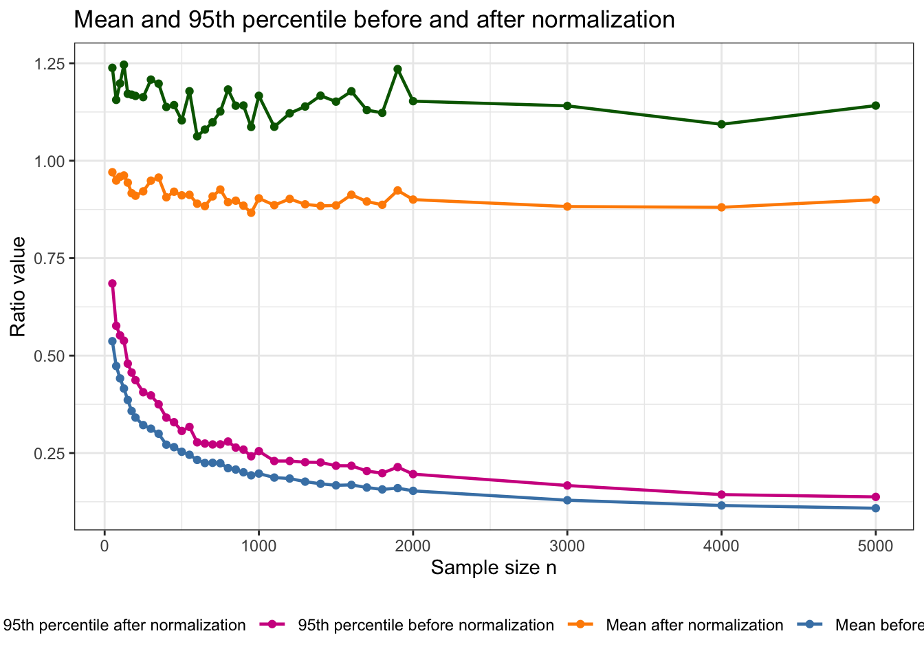
The previous empirical comparison suggested that \(\log n\) provides the most stable normalization for the weighted MST diameter among the candidate functions considered. However, stabilization of the empirical mean alone is not sufficient to conclude that the statistic has become sample-size invariant. The variance, upper tail, and overall shape of the distribution may still change with \(n\). This is particularly important for stringy05, since the practical calibration of the index is based on the 95th percentile of its noise distribution rather than its mean. We therefore examine how the location, spread, upper quantiles, and distributional shape of the normalized stringy05 ratio change with sample size.

Summarise the distribution of the normalized ratio

Code
# before normalization
original_distribution_summary <- uniform_results |>
  mutate(
    original_ratio =
      stringy_diameter / total_mst_length
  ) |>
  group_by(n) |>
  summarise(
    mean = mean(original_ratio, na.rm = TRUE),
    q95 = quantile(original_ratio, 0.95, na.rm = TRUE),
    sd = sd(original_ratio, na.rm = TRUE),
    .groups = "drop"
  )

# after normalization
normalized_distribution_summary <- normalized_ratio_results |>
  group_by(n) |>
  summarise(
    mean = mean(normalized_ratio, na.rm = TRUE),
    median = median(normalized_ratio, na.rm = TRUE),

    variance = var(normalized_ratio, na.rm = TRUE),
    sd = sd(normalized_ratio, na.rm = TRUE),
    iqr = IQR(normalized_ratio, na.rm = TRUE),
    mad = mad(normalized_ratio, na.rm = TRUE),

    q90 = quantile(normalized_ratio, 0.90, na.rm = TRUE),
    q95 = quantile(normalized_ratio, 0.95, na.rm = TRUE),
    q99 = quantile(normalized_ratio, 0.99, na.rm = TRUE),

    .groups = "drop"
  )

For the proposed normalization to remove most of the sample-size dependence, we would expect the mean, median, spread measures, and upper quantiles to become approximately stable for sufficiently large \(n\).

Examine whether the spread stabilizes

Code
# Before normalization
p_sd_original <- ggplot(
  original_distribution_summary,
  aes(x = n, y = sd)
) +
  geom_line(
    colour = "steelblue",
    linewidth = 0.8
  ) +
  geom_point(
    colour = "steelblue"
  ) +
  labs(
    x = "Sample size n",
    y = "Standard deviation",
    title = "SD before normalization"
  ) +
  theme_bw() +
  theme(
    aspect.ratio = 1,
    plot.title = element_text(face = "bold")
  )


# After normalization
p_sd_normalized <- ggplot(
  normalized_distribution_summary,
  aes(x = n, y = sd)
) +
  geom_line(
    colour = "steelblue",
    linewidth = 0.8
  ) +
  geom_point(
    colour = "steelblue"
  ) +
  labs(
    x = "Sample size n",
    y = "Standard deviation",
    title = "SD after normalization"
  ) +
  theme_bw() +
  theme(
    aspect.ratio = 1,
    plot.title = element_text(face = "bold")
  )

p_sd_original + p_sd_normalized

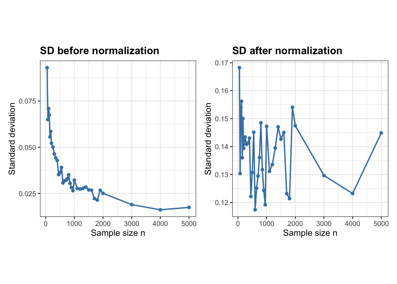
The standard deviation is larger after normalization because the normalized statistic is on a different scale, so the two SD values are not directly comparable. What matters more is how the SD changes with sample size. Before normalization, the SD decreases strongly as \(n\) increases, while after normalization it stays within a much narrower range. This suggests that the normalization reduces the sample-size dependence of the spread, although some variation across \(n\) still remains.

Compare the centre and the 95th percentile

Code
# Summary before normalization
original_distribution_summary <- uniform_results |>
  mutate(
    original_ratio = stringy_diameter / total_mst_length
  ) |>
  group_by(n) |>
  summarise(
    mean_original = mean(original_ratio, na.rm = TRUE),
    q95_original = quantile(original_ratio, 0.95, na.rm = TRUE),
    .groups = "drop"
  )

# Join with normalized summary
comparison_summary <- original_distribution_summary |>
  left_join(
    normalized_distribution_summary |>
      select(
        n,
        mean_normalized = mean,
        q95_normalized = q95
      ),
    by = "n"
  )

# Plot all four together
ggplot(comparison_summary, aes(x = n)) +
  geom_line(
    aes(
      y = mean_original,
      colour = "Mean before normalization"
    ),
    linewidth = 0.8
  ) +
  geom_point(
    aes(
      y = mean_original,
      colour = "Mean before normalization"
    )
  ) +
  geom_line(
    aes(
      y = mean_normalized,
      colour = "Mean after normalization"
    ),
    linewidth = 0.8
  ) +
  geom_point(
    aes(
      y = mean_normalized,
      colour = "Mean after normalization"
    )
  ) +
  geom_line(
    aes(
      y = q95_original,
      colour = "95th percentile before normalization"
    ),
    linewidth = 0.8
  ) +
  geom_point(
    aes(
      y = q95_original,
      colour = "95th percentile before normalization"
    )
  ) +
  geom_line(
    aes(
      y = q95_normalized,
      colour = "95th percentile after normalization"
    ),
    linewidth = 0.8
  ) +
  geom_point(
    aes(
      y = q95_normalized,
      colour = "95th percentile after normalization"
    )
  ) +
  scale_colour_manual(
    name = NULL,
    values = c(
      "Mean before normalization" = "steelblue",
      "Mean after normalization" = "darkorange",
      "95th percentile before normalization" = "violetred",
      "95th percentile after normalization" = "darkgreen"
    )
  ) +
  labs(
    x = "Sample size n",
    y = "Ratio value",
    title = "Mean and 95th percentile before and after normalization"
  ) +
  theme_bw() +
  theme(
    legend.position = "bottom"
  )

The normalized ratio appears more stable across sample sizes; however, the 95th percentile of the normalized statistic can exceed 1. This is an important limitation because scagnostic indices are intended to lie between 0 and 1. The normalization therefore removes the natural upper bound of the original stringy05 definition. Using this normalized ratio directly as a new scagnostic would require an additional transformation or rescaling to return the values to \([0,1]\), which adds another layer of complexity to the definition.

Comparison of Weighted Stringy05 and Hop-based Stringy

Objective

We aim to compare the original weighted Stringy05 with an alternative definition based on the hop diameter of the minimum spanning tree (MST).

The two definitions are:

\[S_{weighted}=\frac{D_w}{L_{\text{MST}}}\]

\[S_{hop}=\frac{D_h}{n-1}\]

We investigate whether the hop-based definition produces similar results for structured patterns and Gaussian noise, particularly whether its 95th percentile exhibits similar sample-size dependence.

All comparisons use the same MST, without hexagonal binning or outlier removal, to isolate the effect of the diameter definition.

Compare both Stringy definitions

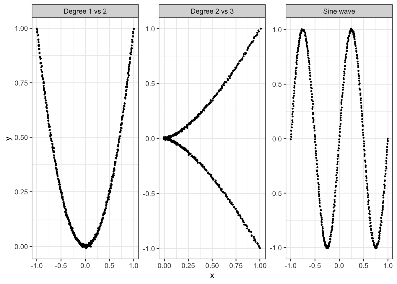
We compute the weighted diameter, hop diameter and total MST length, then calculate both Stringy values and their difference. Then we investigate whether both definitions identify string-like structures similarly.

Code
# Comparing weighted diameter version and hop diameter version of stringy05
compare_stringy <- function(x, y) {
  
  sc <- scree(x, y, binner = NULL, out.rm = FALSE)
  mst <- cassowaryr:::gen_mst(sc$del, sc$weights)
  
  w <- igraph::E(mst)$weight
  L <- sum(w)
  
  dw <- igraph::diameter(mst, weights = w)
  dh <- igraph::diameter(mst, weights = NA)
  
  sw <- dw / L
  sh <- dh / (length(x) - 1)
  
  data.frame(
    weighted_diameter = dw,
    hop_diameter = dh,
    mst_length = L,
    weighted_stringy = sw,
    hop_stringy = sh,
    difference = sw - sh
  )
}


# 2. Compare structured patterns ----------------------------------------

set.seed(1050)

n <- 500
t <- seq(-1, 1, length.out = n)
noise_sd <- 0.005

patterns <- list(
  "Degree 1 vs 2" = list(x = t, y = t^2),
  "Degree 2 vs 3" = list(x = t^2, y = t^3),
  "Sine wave" = list(x = t, y = sin(2 * pi * t))
)

pattern_data <- lapply(names(patterns), function(name) {
  p <- patterns[[name]]
  data.frame(
    structure = name,
    x = p$x + rnorm(n, sd = noise_sd),
    y = p$y + rnorm(n, sd = noise_sd)
  )
})

pattern_results <- do.call(rbind, lapply(pattern_data, function(d) {
  data.frame(structure = d$structure[1], compare_stringy(d$x, d$y))
}))

kable(pattern_results, digits = 4)
structure weighted_diameter hop_diameter mst_length weighted_stringy hop_stringy difference
Degree 1 vs 2 2.6735 403 3.1085 0.8601 0.8076 0.0524
Degree 2 vs 3 2.4317 332 2.8568 0.8512 0.6653 0.1858
Sine wave 4.4915 468 4.6058 0.9752 0.9379 0.0373
Code
ggplot(do.call(rbind, pattern_data), aes(x, y)) +
  geom_point(size = 0.5) +
  facet_wrap(~ structure, scales = "free") +
  theme(aspect.ratio = 1) +
  theme_bw()

Gaussian-noise simulation results

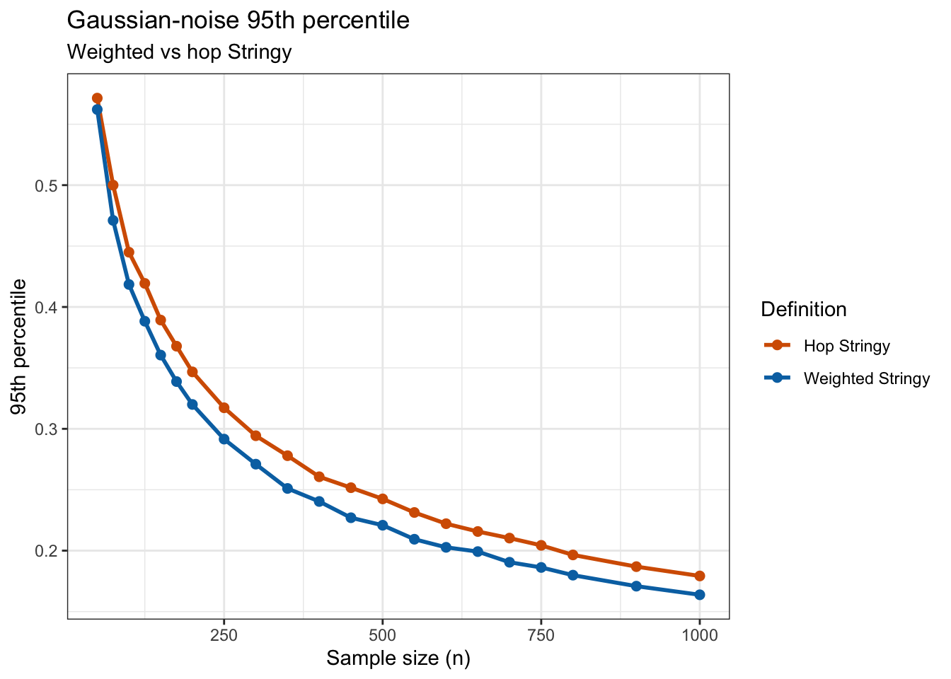
We compared the original weighted Stringy05 with an alternative hop-based definition to investigate their behaviour under Gaussian noise. For sample sizes ranging from 50 to 1,000, we generated 1,000 independent Gaussian datasets per sample size and calculated both indices using the same MST. We then combined the simulation results, estimated their 95th percentiles, and plotted these against sample size. The aim is to determine whether the two definitions exhibit similar sample-size dependence.

Code
files <- 
  c(
    "stringy05_weighted_hop_50_200.csv",
    "stringy05_weighted_hop_250_500.csv",
    "stringy05_weighted_hop_550_750.csv",
    "stringy05_weighted_hop_800_1000.csv"
  )

results <- bind_rows(lapply(files, read_csv, show_col_types = FALSE))
Code
q95_results <- results |>
  group_by(n) |>
  summarise(
    n_sim = n(),
    weighted_q95 = quantile(weighted_stringy, 0.95),
    hop_q95 = quantile(hop_stringy, 0.95),
    .groups = "drop"
  ) |>
  mutate(difference = weighted_q95 - hop_q95)

kable(q95_results, digits = 4)
n n_sim weighted_q95 hop_q95 difference
50 1000 0.5621 0.5714 -0.0094
75 1000 0.4710 0.5000 -0.0290
100 1000 0.4185 0.4449 -0.0265
125 1000 0.3883 0.4194 -0.0311
150 1000 0.3605 0.3893 -0.0288
175 1000 0.3388 0.3678 -0.0290
200 1000 0.3200 0.3467 -0.0267
250 1000 0.2916 0.3173 -0.0257
300 1000 0.2710 0.2943 -0.0233
350 1000 0.2511 0.2779 -0.0269
400 1000 0.2404 0.2607 -0.0203
450 1000 0.2270 0.2517 -0.0247
500 1000 0.2209 0.2425 -0.0216
550 1000 0.2094 0.2313 -0.0220
600 1000 0.2027 0.2221 -0.0194
650 1000 0.1992 0.2157 -0.0165
700 1000 0.1905 0.2103 -0.0198
750 1000 0.1862 0.2043 -0.0181
800 1000 0.1799 0.1965 -0.0166
900 1000 0.1709 0.1869 -0.0160
1000 1000 0.1638 0.1792 -0.0154
Code
q95_long <- q95_results |>
  pivot_longer(
    cols = c(weighted_q95, hop_q95),
    names_to = "definition",
    values_to = "q95"
  )

ggplot(q95_long, aes(n, q95, colour = definition)) +
  geom_line(linewidth = 1) +
  geom_point(size = 2) +
  scale_colour_manual(
    values = c(
      "weighted_q95" = "#0072B2",
      "hop_q95" = "#D55E00"
    ),
    labels = c(
      "weighted_q95" = "Weighted Stringy",
      "hop_q95" = "Hop Stringy"
    )
  ) +
  labs(
    title = "Gaussian-noise 95th percentile",
    subtitle = "Weighted vs hop Stringy",
    x = "Sample size (n)",
    y = "95th percentile",
    colour = "Definition"
  ) +
  theme(aspect.ratio = 1) +
  theme_bw()

Comparison of Stringy Definitions Across 100 Simulations

We first compared the original weighted-diameter Stringy05 with an alternative based on hop diameter using three structured patterns. The degree 2 versus degree 3 pattern showed a noticeably different score for the two definitions in a single run. To investigate whether this was an isolated result or a consistent difference, we repeated each structured simulation 100 times, calculating both indices on the same minimum spanning tree (MST) in every run.

All simulations used \(n=500\), noise standard deviation \(0.005\), no binning, and no outlier removal.

Read the simulation results

Code
results <- read.csv("stringy_structures_100_results.csv")
summary_data <- read.csv("stringy_structures_100_summary.csv")

Minimum, mean, and maximum scores

Code
kable(
  summary_data[, c(
    "structure", "weighted_min", "weighted_mean", "weighted_max",
    "hop_min", "hop_mean", "hop_max"
  )],
  digits = 4
)
structure weighted_min weighted_mean weighted_max hop_min hop_mean hop_max
Degree 1 vs 2 0.8337 0.8684 0.8983 0.7796 0.8188 0.8457
Degree 2 vs 3 0.8403 0.8650 0.8935 0.6493 0.6859 0.7295
Sine wave 0.9736 0.9810 0.9894 0.9379 0.9513 0.9679

Visualizing weighted and hop diameter paths for degree 2 vs 3

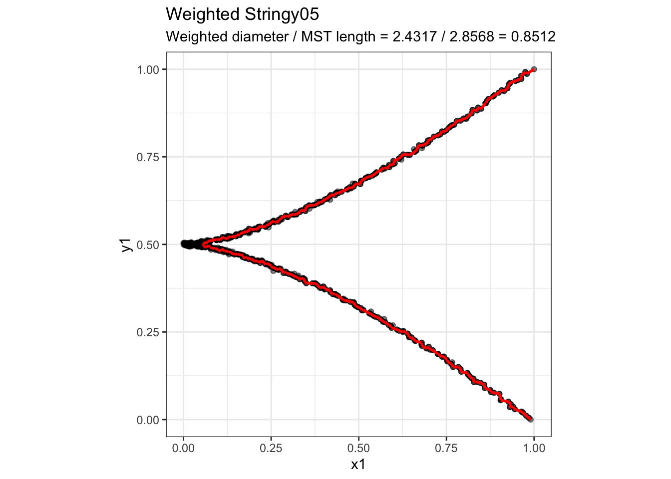
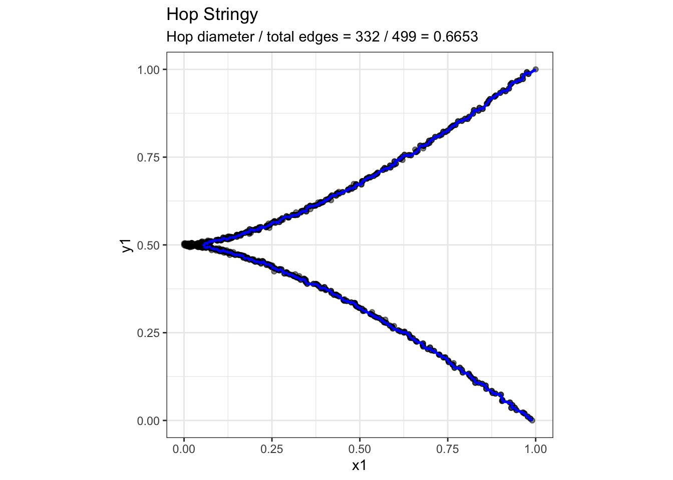
The hop-based Stringy index produces a noticeably different score from the original weighted version for the degree 2 vs 3 polynomial structure. To better understand this difference, we visualize the MST and highlight the diameter paths identified by each definition. This allows us to investigate whether the two methods select different paths and how edge lengths versus edge counts influence their Stringy scores.

Code
# Degree 2 vs 3 only
d <- pattern_data[[2]]

sc <- scree(d$x, d$y, binner = NULL, out.rm = FALSE)
mst <- cassowaryr:::gen_mst(sc$del, sc$weights)

w <- igraph::E(mst)$weight
L <- sum(w)
n <- length(d$x)

# Diameter paths
pw <- igraph::get_diameter(mst, weights = w)
ph <- igraph::get_diameter(mst, weights = NA)

xy <- sc$del$x

path_df <- function(path) {
  i <- head(as.integer(path), -1)
  j <- tail(as.integer(path), -1)

  data.frame(
    x = xy[i, 1], y = xy[i, 2],
    xend = xy[j, 1], yend = xy[j, 2]
  )
}

# Calculate complete Stringy ratios
sw <- igraph::diameter(mst, weights = w) / L
sh <- igraph::diameter(mst, weights = NA) / (n - 1)

# Plot function
plot_stringy <- function(path, title, subtitle, colour) {
  draw_mst(sc) +
    geom_segment(
      data = path_df(path),
      aes(x, y, xend = xend, yend = yend),
      inherit.aes = FALSE,
      colour = colour,
      linewidth = 1
    ) +
    labs(title = title, subtitle = subtitle) +
    theme_bw() +
    theme(aspect.ratio = 1)
}

# Original weighted Stringy
plot_stringy(
  pw,
  "Weighted Stringy05",
  sprintf("Weighted diameter / MST length = %.4f / %.4f = %.4f",
          sw * L, L, sw),
  "red"
)

Code
# Hop-based Stringy
plot_stringy(
  ph,
  "Hop Stringy",
  sprintf("Hop diameter / total edges = %d / %d = %.4f",
          length(ph) - 1, n - 1, sh),
  "blue"
)

Appendix

Alternative way

Scaling limits of the Euclidean minimum spanning tree

A potentially useful theoretical connection for understanding the sample-size behaviour of the Stringy index is provided by Aizenman et al. (1999).

Aizenman et al. study continuum scaling limits of several random spanning-tree models in two dimensions. Of particular relevance here is their Euclidean minimal spanning tree (EST). The vertices of the EST are generated from a homogeneous Poisson point process in \(\mathbb{R}^2\) with intensity \(\delta^{-2}\). Every pair of points can be connected, the weight of an edge is its ordinary Euclidean distance, and the Euclidean MST is the spanning tree that minimises the sum of these Euclidean edge lengths (Aizenman et al. 1999).

Thus, if \(X_i\) and \(X_j\) denote two points, the edge weight is

\[ w_{ij} = \lVert X_i-X_j\rVert_2. \]

This setup is important because the edge weights are generated by Euclidean geometry rather than being independent random edge weights. It is therefore substantially closer to the MST used in the Stringy index than random complete-graph MST models based on independent Uniform\((0,1)\) edge weights.

Aizenman et al. investigate what happens as

\[ \delta \rightarrow 0, \] so that the Poisson point process becomes increasingly dense. This can be viewed of studying an increasingly large number of points in a fixed two-dimensional region.

Main findings

Aizenman et al. establish tightness of the distributions of these spanning trees and show that subsequential continuum scaling limits exist (Aizenman et al. 1999). Their main geometric finding is that the branches of the limiting Euclidean MST are random curves with non-trivial fractal geometry.

In particular, the Hausdorff dimension of the limiting branches is bounded by

\[ 1 < d_{\min} \leq \dim_H(C) \leq d_{\max} < 2, \]

for non-random constants \(d_{\min}\) and \(d_{\max}\) (Aizenman et al. 1999).

The fact that the dimension is strictly greater than one means that these branches are substantially rougher than ordinary smooth curves. Aizenman et al. prove, more strongly, that the limiting branches are nonrectifiable (Aizenman et al. 1999; Aizenman and Burchard 1999).

A rectifiable curve has finite ordinary arc length. For example, a straight line, circle, or sufficiently smooth curve has a finite length that is approached as the curve is measured at increasingly fine resolutions. A nonrectifiable curve does not have finite ordinary arc length. Increasingly fine resolution reveals additional geometric detail, so the polygonal length does not settle to a finite limiting value (Aizenman and Burchard 1999; Mandelbrot 1967).

References

Addario-Berry, Louigi, Nicolas Broutin, and Bruce Reed. 2006. “The Diameter of the Minimum Spanning Tree of a Complete Graph.” Discrete Mathematics & Theoretical Computer Science Proceedings AG: 237–48. https://doi.org/10.46298/dmtcs.3513.
Aizenman, Michael, and Almut Burchard. 1999. “Hölder Regularity and Dimension Bounds for Random Curves.” Duke Mathematical Journal 99 (3): 419–53. https://doi.org/10.1215/S0012-7094-99-09914-3.
Aizenman, Michael, Almut Burchard, Charles M. Newman, and David B. Wilson. 1999. “Scaling Limits for Minimal and Random Spanning Trees in Two Dimensions.” Random Structures & Algorithms 15 (3–4): 319–67. https://doi.org/10.1002/(SICI)1098-2418(199910/12)15:3/4<319::AID-RSA8>3.0.CO;2-G.
Mandelbrot, Benoit B. 1967. “How Long Is the Coast of Britain? Statistical Self-Similarity and Fractional Dimension.” Science 156 (3775): 636–38. https://doi.org/10.1126/science.156.3775.636.
Penrose, Mathew D. 1997. “The Longest Edge of the Random Minimal Spanning Tree.” The Annals of Applied Probability 7 (2): 340–61.
Steele, J. Michael. 1988. “Growth Rates of Euclidean Minimal Spanning Trees with Power Weighted Edges.” The Annals of Probability 16 (4): 1767–87. https://doi.org/10.1214/aop/1176991596.
Reuse

All Rights Reserved